
Capacitive Display Dentistry
Touchscreen UI for a Clinical Tool That Demands Full Attention

Context
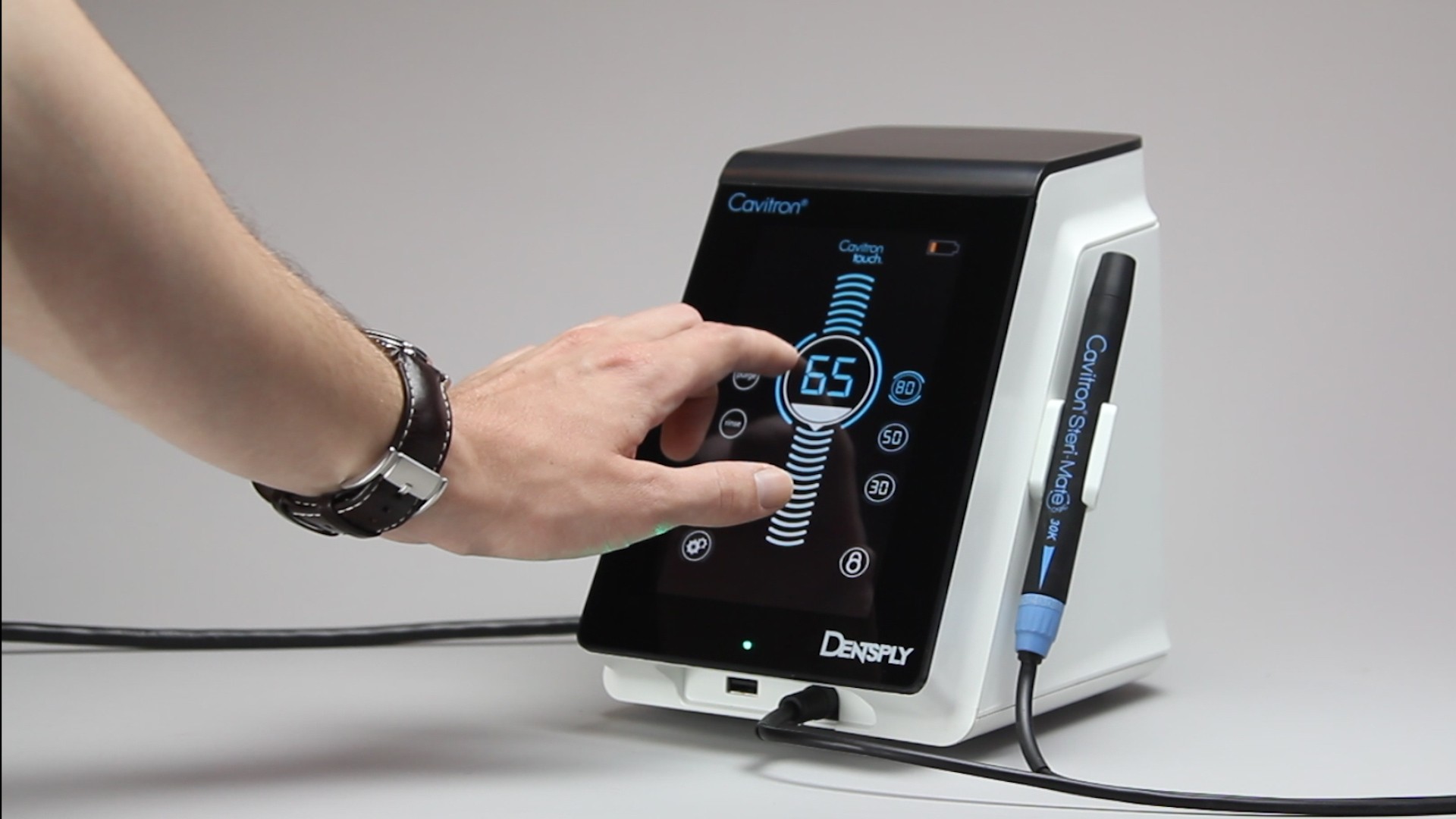
The Cavitron has been a fixture in dental operatories for decades — a trusted ultrasonic scaling tool used by dentists and hygienists to remove calculus, plaque, and biofilm from teeth. Dentsply's next generation introduced something new: a touchscreen interface, replacing the previous generation's physical knobs and buttons.
TEAMS designed the physical housing. My predecessor had begun establishing a visual direction for the UI. I came in mid-project to inherit that work, integrate a new feature, ensure the interface met clinical accessibility standards, and finalize everything for manufacturing. The result became Dentsply Sirona's first digital design language — and it's still in use today.
Problem
Designing a touchscreen for a dental operatory isn't like designing for a phone or a tablet. The users — dentists and dental hygienists — are wearing gloves, often mid-procedure, with their attention on the patient rather than the screen. Every interaction has to be fast, unambiguous, and forgiving of imprecise input.
The interface also had to communicate device state clearly at a glance: is it scaling? Rinsing? Running a purge cycle? What power level is active? The previous generation answered these questions with physical controls. The touchscreen had to answer them visually, instantly, without requiring the clinician to read carefully or navigate menus.
There was also an inheritance challenge. I had no formal handoff from the previous designer — just Illustrator files to reverse-engineer. Understanding what had already been decided, what was intentional versus unfinished, and where I had latitude to refine was itself a design challenge before any design work began.
Approach
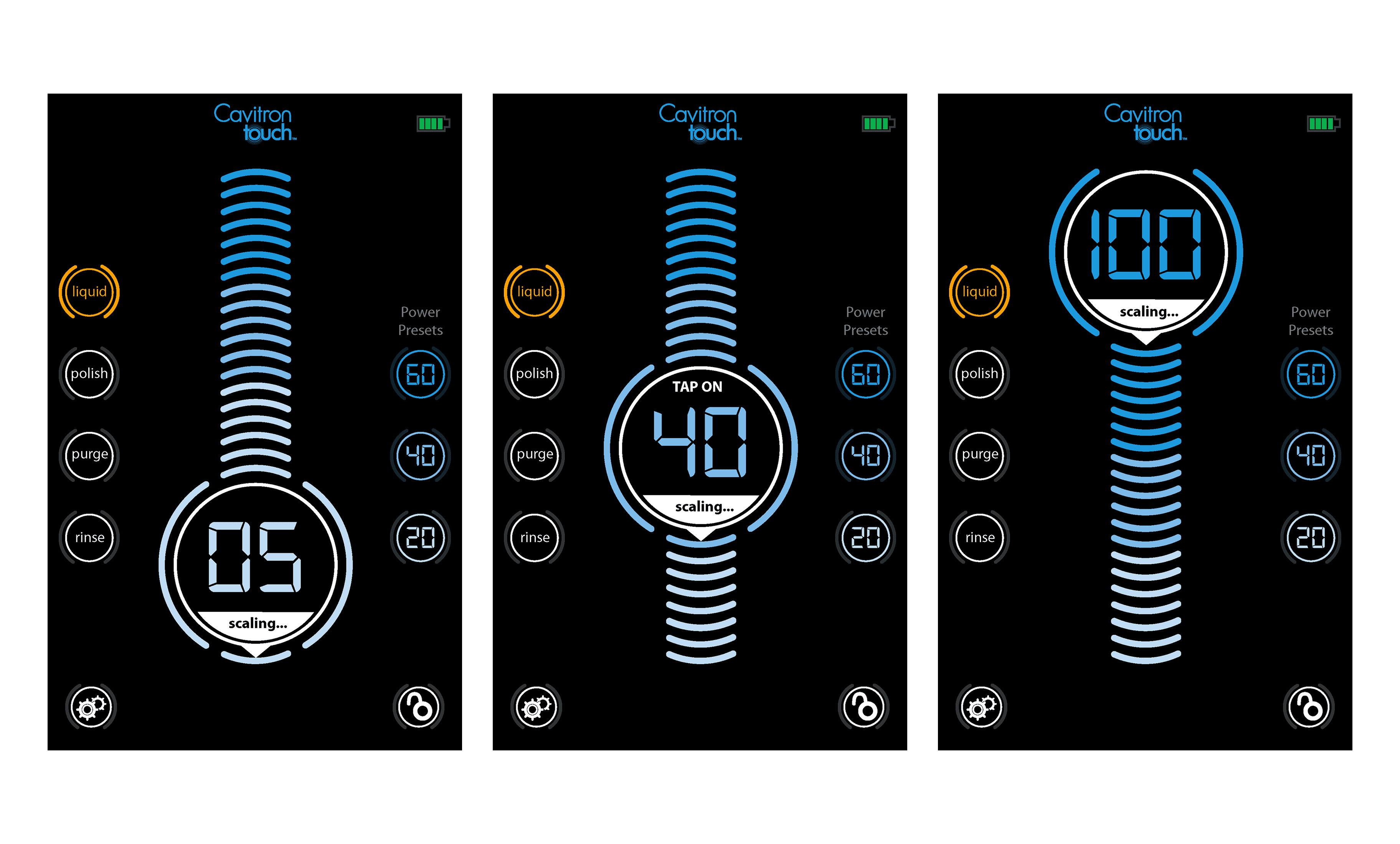
Designing for a loud, gloved, patient-focused environment. A dental office is noisier than people expect — the scaler itself, suction, patient anxiety. Audio feedback is unreliable. Visual feedback competes with the clinician's primary focus, which is the patient. That left haptics as the most dependable feedback channel. Every button press and incremental slider point needed to confirm itself physically, through the glass. I designed all touch targets to account for gloved hands — enlarged interaction areas, increased color contrast, clear active/pressed/disabled states — but the haptic response was the layer that made the interface genuinely trustworthy in a clinical setting. When your hands are gloved and your eyes are on someone's teeth, you need to feel that the device registered your input.
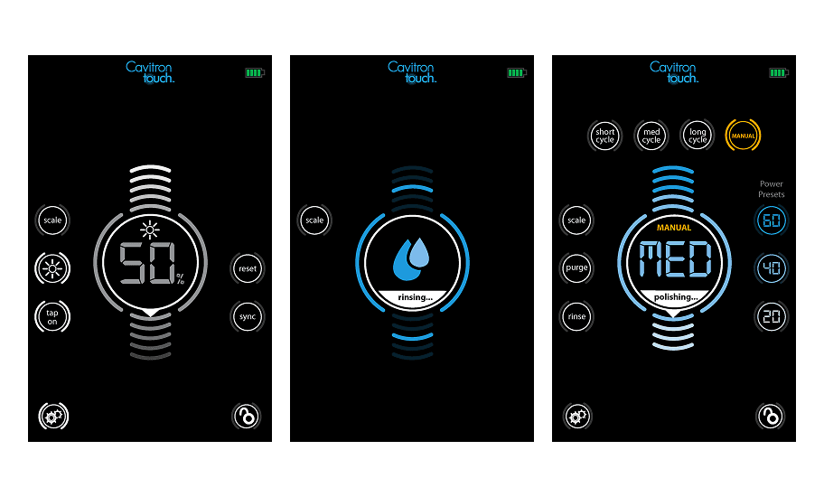
State communication through the central dial. The dominant UI element is a circular dial — a visual metaphor that echoes the ultrasonic wave action of the device itself. The radiating lines above and below the dial visualize the tool's activity, expanding and contracting with power level. Current mode and power setting are always visible at the center. This gives clinicians a single focal point that answers the most important question — what is the device doing right now — without requiring them to scan the screen.
Color as a clinical communication system. Blue indicates active scaling mode — the primary clinical function. Amber signals mode changes requiring attention: Liquid mode, Boost, Manual overrides. The color shift is immediate and unmistakable, designed to be readable in peripheral vision while the clinician's focus is on the patient. The dark background maximizes contrast and reduces eye strain under operatory lighting.
Integrating Boost without disrupting the system. Boost was a new feature that needed to fit naturally into an already-established interface. Rather than adding new UI real estate, Boost activates as a labeled state within the existing central dial — the word "BOOST" appears in amber at the top of the dial face, with the power value displayed below. It's visible, it's distinct from normal operation, but it doesn't require learning a new pattern.
Solution
A complete touchscreen UI system for the Cavitron Touch™: dark-mode interface, circular dial as primary state communicator, circular touch targets arranged in a consistent orbital layout, color-coded mode states, and a full set of interaction states across all screens — scaling, polishing, rinsing, purging, power preset selection, settings, and Boost.
Impact
The Cavitron Touch™ launched in 2015 and remains on the market today — the interface I designed is still the face of one of Dentsply Sirona's flagship clinical tools more than a decade later. The UI earned a design patent, recognizing the visual system as novel, defensible intellectual property. TEAMS describes it as Dentsply Sirona's first digital design language: a foundation that set the standard for the brand's touchscreen products going forward.
© 2026