
Credibility by Design
Building a Complete Brand Identity for a Global Corrosion Control Company
Context
SMARTCORR Systems is a global corrosion control company serving the oil and gas industry — protecting pipelines, rigs, and critical infrastructure across North America, the Middle East, and Asia Pacific. Their founder came to TEAMS with serious technical expertise and an ambitious growth plan. What he didn't have was a brand.
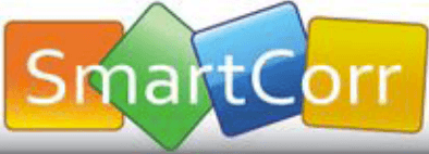
The existing identity was a colorful, consumer-feeling logo that communicated nothing about the precision, authority, or industrial credibility the company needed to compete for Fortune 500 energy clients like Shell, ExxonMobil, and Chevron. The products were sophisticated. The brand wasn't.
Problem
Corrosion control is a crowded, technical market where buyers are procurement teams and engineers at major energy companies. Trust and credibility aren't nice to have — they're the purchase decision. A brand that looks amateur signals an amateur operation, regardless of the actual product quality underneath.
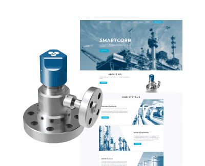
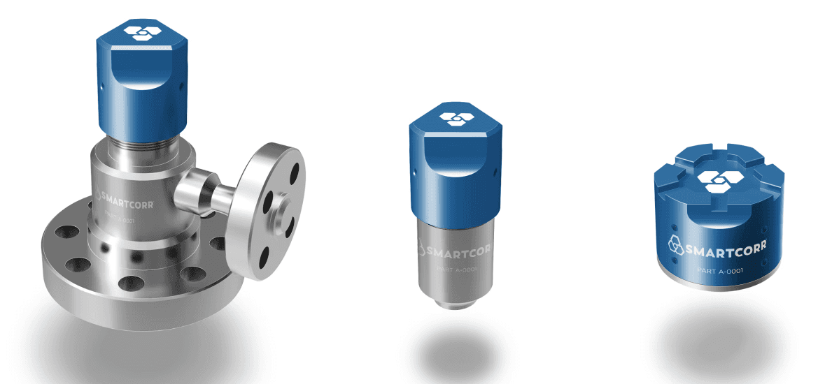
There was also a physical environment to design for. SMARTCORR's products live on oil rigs and pipeline infrastructure — dark, visually cluttered, high-contrast environments where brand visibility directly intersects with safety. The blue caps on their access fittings needed to be identifiable at a glance on a busy rig, which meant color choice wasn't just a brand exercise. It was a functional one.
And there was a second, equally important user: the founder himself. The website needed to be something a two-person company could actually maintain — he needed to update product listings, upload images, and edit copy without a developer on call. My end user wasn't just the procurement manager evaluating SMARTCORR's credibility. It was the founder himself.
Before
Approach
I was the sole graphic and brand designer on the project, collaborating with senior industrial designer Ross on the physical product language. We approached all four workstreams simultaneously — logo, color, visual brand language, and website — so that branding, product, and digital presence evolved together rather than sequentially.
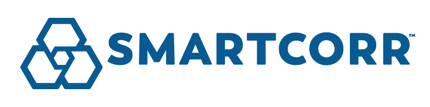
Competitor benchmarking drove the color strategy. Research showed the corrosion control industry was dominated by orange, blue, and red — colors that had become visual noise in the category. We presented three distinct directions: purple, green, and bright blue. Blue won, but not just any blue. We developed a family of four values — SMARTCORR Blue, Bright Blue, Dark Blue, and Lime — with the lime reserved as a strategic accent, a distinctive pop against an otherwise authoritative palette. The deeper Smartcorr Blue added strength and authority the previous palette lacked entirely.

The logo mark is structural and symbolic. Three interlocking hexagonal shields protect a central core — molecular in feel, systematic in structure, impervious by design. It communicates protection, precision, and interconnected systems simultaneously. Set in Boston, a geometric sans-serif with softly rounded characters and multiple weights, the wordmark is robust without feeling cold. The type system also had to support multiple languages given SMARTCORR's international client base.
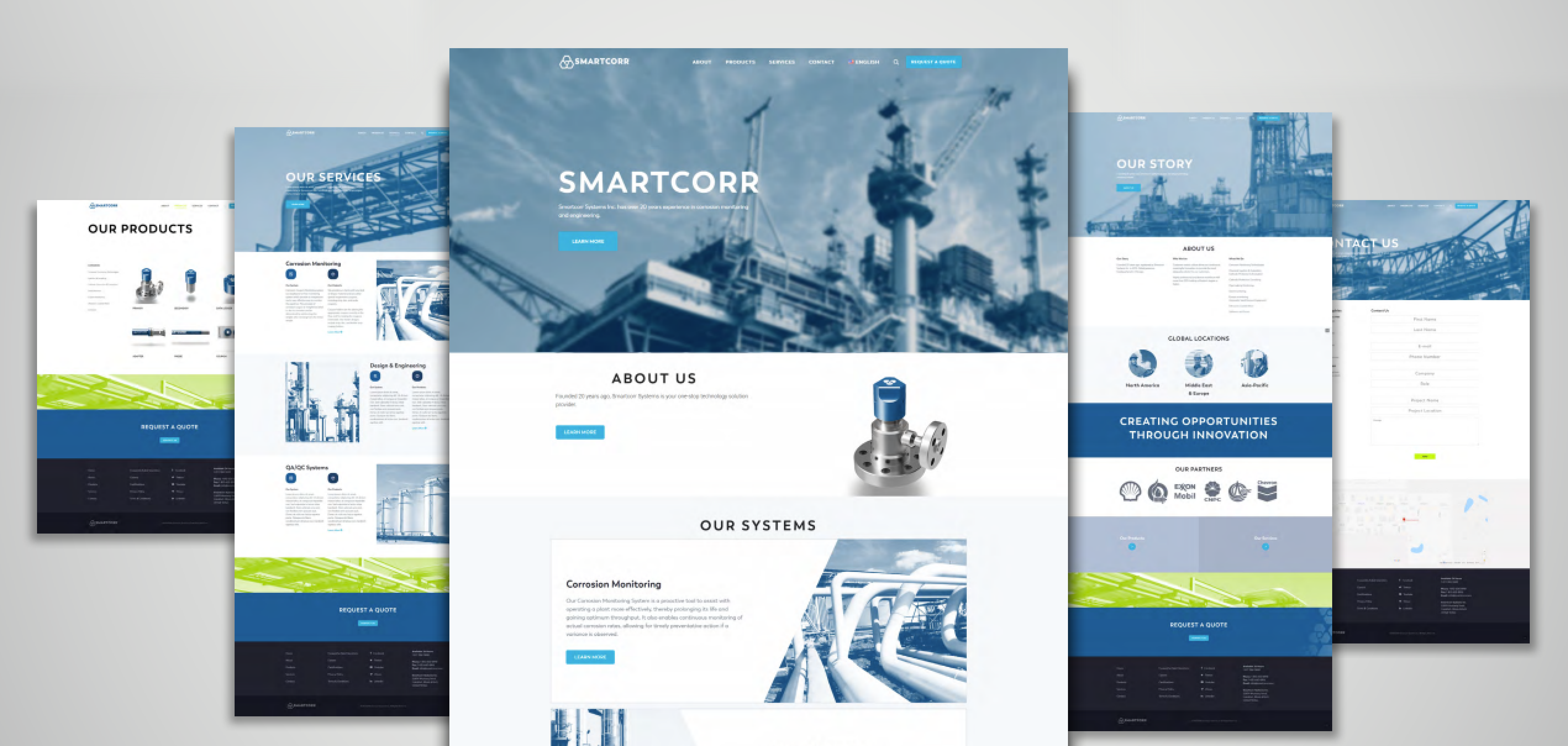
The website was built for one specific person. Rather than a custom build, I selected and customized a WordPress theme chosen specifically because the founder already knew WordPress. The structure — Home, About, Products (with filterable categories), Services, Contact — gave the company room to grow its product catalog without developer involvement. The lime green appears sparingly throughout as link color and accent, carrying the brand energy without overwhelming the professional tone.
After
Solution
A complete visual brand system applied across every touchpoint:
Identity system — Primary logo, secondary icon mark, full color family, type system, and usage guidelines across light, dark, and color backgrounds.
Product family — Brand applied to the full SMARTCORR product line, with the distinctive blue caps serving as both brand identifier and visual marker on industrial job sites. The hexagonal logo mark embossed directly into the cap surface.
Branded touchpoints — Hard hat, van wrap, lanyard, business cards, and sales brochure. Designed to function as a complete sales and field presence toolkit for a lean two-person operation.
Website — Full site design and build on WordPress: Home, About, Products, Services, and Contact pages. Product catalog structured for self-service updates. Lime green accents used at interaction points (CTAs, links) consistent with brand guidelines.
Impact
SMARTCORR launched with a brand identity that positioned them to compete credibly against established industry players for major energy clients — including Shell, ExxonMobil, CNPC, and Chevron, all of whom appear as partners on the live site.
The website received was one he could actually use. Product listings, service pages, and company information have all been updated and expanded since launch — the site has grown with the company without requiring ongoing design intervention.
The brand system also scaled forward. The visual language established for the initial product line extended cleanly to SMARTCORR's subsequent product categories — servers, monitoring systems, field equipment cases — without requiring redesign.
© 2026